DSCI 100 Week 6 : Classification
Sky (Kehan) Sheng
📋 Housekeeping: Midterm
- Midterm: Thursday, Oct 22, 8AM, 70 minutes long, starting at the beginning of our tutorial period.
- Midterm coverage: Weeks 1 to 6 (including today’s content).
- Closed book quiz on Canvas: Multiple-choice questions, short answer questions, and fill-in-the-blank questions.
- No live-coding quizes, and we will not run your code. However, fill-in-the-blank do ask you to write the correct function name or code snippet.
- Requires the Lockdown Browser. Install and test it using the Canvas iPohone_poll assignment on the laptop you will bring.
📋 Housekeeping: Midterm
Important
- Bring a laptop. The Lockdown Browser does not work on an iPad or phone.
- Bring your UBC ID card to the midterm, we will check it during the exam.
- No AI glasses or any recording or communication devices are allowed!
🔁 Week 5 Recap: Version control
iClicker: Where did my change go?
iClicker: Put them in order
🔁 Recap: map_dfr() and facets
🤔 mutate() or map_dfr()?
{
  // Layout only: both outputs, the code and the captions were computed in R.
  const m = transpose(recap_modes).find(d => d.fn === recap_fn);
  const out = transpose(recap_out).filter(d => d.fn === recap_fn);
  const table = (cells, highlight) => {
    const cols = [...new Set(cells.map(d => d.column))];
    const rows = [...new Set(cells.map(d => d.row))];
    // a zero-width space after each underscore lets long column names wrap
    const head = cols.map(c => html`<th style="white-space: normal; max-width: 120px; color: ${highlight(c) ? "#eb6834" : "inherit"};">${c.replaceAll("_", "_\u200b")}</th>`);
    const body = rows.map(r => html`<tr>${cols.map(c => {
      const d = cells.find(e => e.row === r && e.column === c);
      return html`<td style="${highlight(c) ? "color: #eb6834; font-weight: bold;" : ""}">${d.value}</td>`;
    })}</tr>`);
    return html`<table class="compact" style="font-size: 15px;"><tr>${head}</tr>${body}</table>`;
  };
  const isNew = c => out.find(d => d.column === c).is_new;
  return html`<div style="display: flex; gap: 24px; align-items: center; justify-content: center;">
      <div><div class="ds-caption" style="font-size: 17px;">penguin_sizes: 5 rows</div>
        ${table(transpose(recap_in_long), c => false)}</div>
      <div style="font-size: 30px; color: #b8b6b0;">→</div>
      <div><div class="ds-caption" style="font-size: 17px;">${m.out_shape}</div>
        ${table(out, isNew)}</div>
    </div>
    <pre style="font-size: 16px; text-align: center;"><code>${m.code}</code></pre>
    <div class="ds-caption" style="font-size: 19px;">${m.caption}</div>`;
}
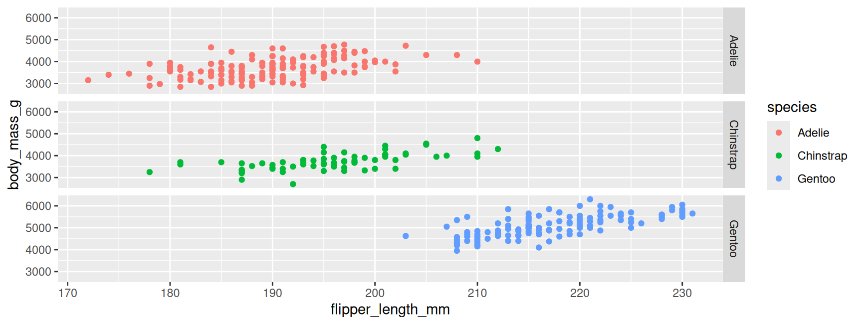
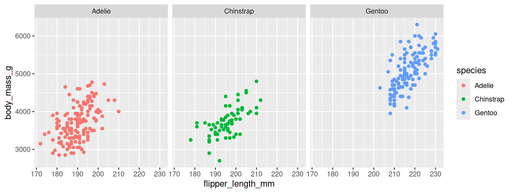
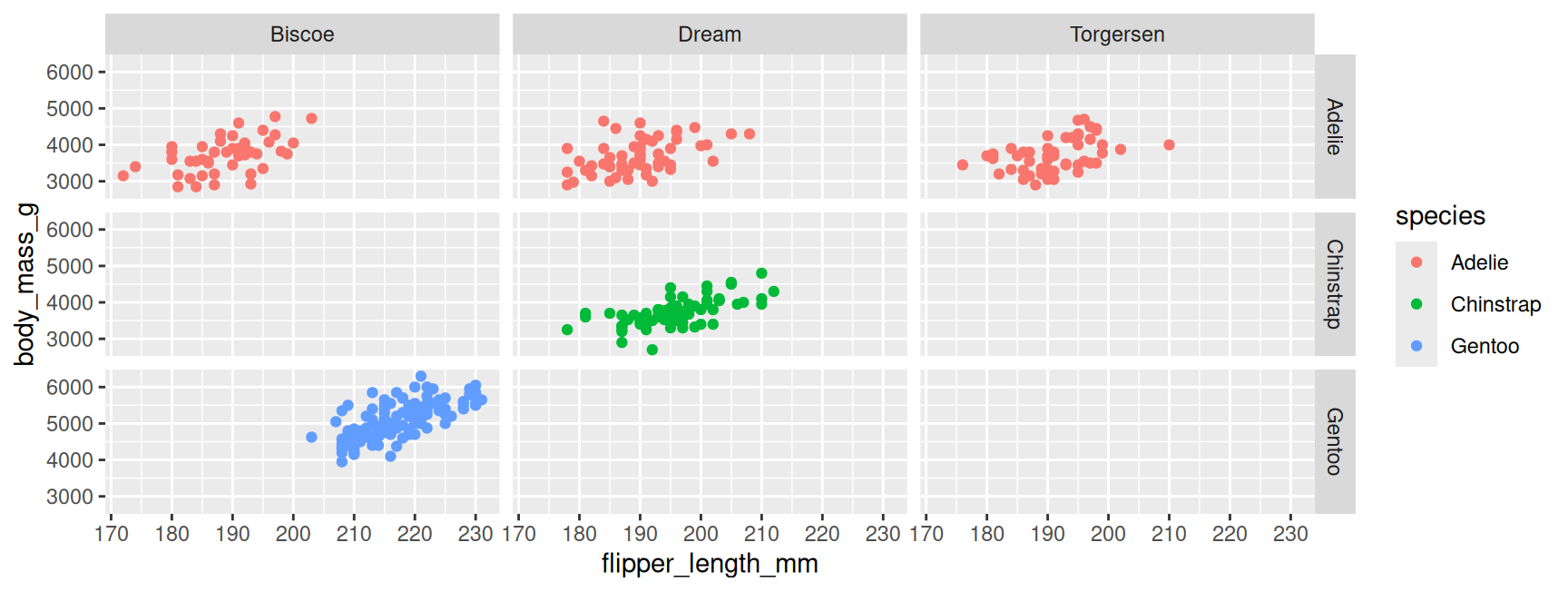
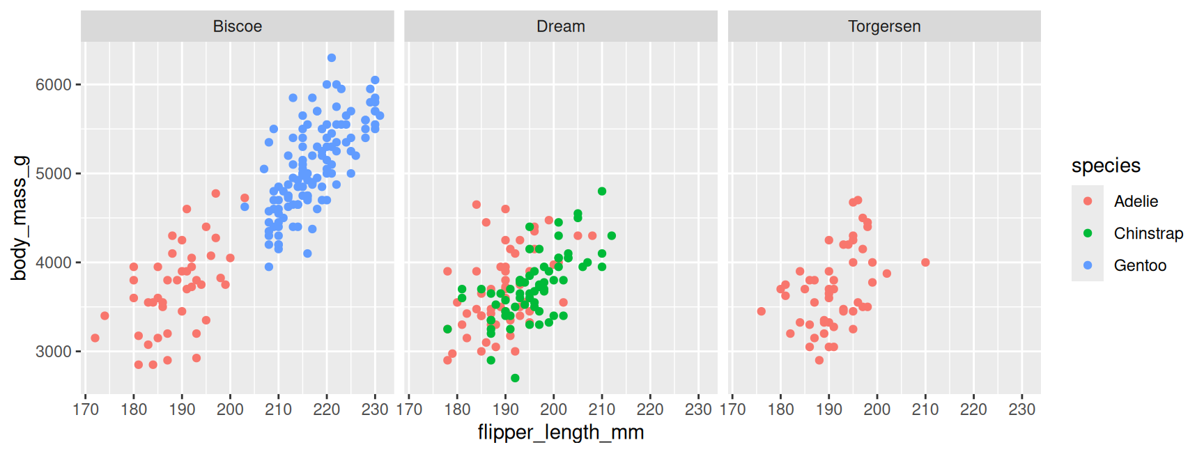
📊 facet_grid() or facet_wrap()?
One small plot per group, on the same axes. facet_grid() lays the panels out as a table of rows and columns. facet_wrap() fills them left to right, then wraps onto a new line, like words on a page.
Week 6: Classification
🎯 Today’s Learning Objectives
By the end of today, you will be able to:
- Explain how the K nearest neighbours (KNN) predicts the label of a new observation.
- Understand why we need to standardize the predictors before using KNN.
- Build a classifier in R with a recipe, a model, and a workflow.
- Predict the category of a new observation.
🤔 Is this tumour dangerous?
A doctor takes a few cells from a new tumour and measures them under a microscope. Is it benign (not cancer) or malignant (cancer)?
{
  // Draw only: every tumour, the new tumour and the axis range were prepared in R.
  const r = transpose(knn_range)[0];
  const a = transpose(knn_new).find(d => d.tumour === "A");
  return Plot.plot({
    width: r.inner_w + 80, height: r.inner_h + 66, marginLeft: 70, marginBottom: 56,
    marginTop: 10, marginRight: 10,
    style: {fontSize: "16px", background: "transparent"},
    x: {domain: [r.x_min, r.x_max], label: "Perimeter (standardized)", labelAnchor: "center", grid: true},
    y: {domain: [r.y_min, r.y_max], label: "Concavity (standardized)", labelAnchor: "center", grid: true},
    color: {domain: ["benign", "malignant"], range: ["#2a78d6", "#eb6834"], legend: true},
    marks: [
      Plot.dot(transpose(knn_points), {x: "Perimeter", y: "Concavity", fill: "diagnosis",
                                       r: 3, fillOpacity: 0.6}),
      Plot.dot([a], {x: "Perimeter", y: "Concavity", symbol: "star", r: 9,
                     fill: "#52514e", stroke: "white"}),
      Plot.text([a], {x: "Perimeter", y: "Concavity", text: () => "new tumour",
                      dx: 12, textAnchor: "start", fill: "#52514e", fontWeight: "bold",
                      stroke: "white", strokeWidth: 4})
    ]
  });
}
Each dot is one past tumour, 569 in total, already diagnosed by a doctor.
The star is the new tumour. Benign or malignant?
How did you decide?
You looked at its neighbours. 🏘️
✏️ Classification
- We have past observations whose label we already know: benign or malignant.
- We have a new observation whose label we don’t know.
- We use the past to predict the label of the new one.
| Word | Meaning | In our example |
|---|---|---|
| observation | one row | one tumour |
| predictors | the columns we use to decide | Perimeter, Concavity |
| class (label) | the category we predict | benign or malignant |
| training set | past observations with known labels | the 569 diagnosed tumours |
iClicker: What kind of question?
🔄 Where are we in the workflow?
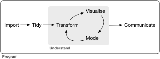
Weeks 1 to 4: import, tidy, transform, visualize. Today we start to model.
Source: Grolemund & Wickham, R for Data Science
🏘️ K-nearest neighbours, step by step
{
  // Draw only: distances, ranks, captions and axis ranges were computed in R.
  const r = transpose(knn_range)[0];
  const s = transpose(knn_steps).find(d => d.step === knn_step);
  const a = transpose(knn_new).find(d => d.tumour === "A");
  const near = transpose(knn_near).filter(d => d.tumour === "A");
  const shown = s.show === "top5" ? near.filter(d => d.rank <= 5)
              : s.show === "topk" ? near.filter(d => d.rank <= 3) : [];
  const circle = transpose(knn_circles).filter(d => d.tumour === "A" && d.k === 3);
  const color = {domain: ["benign", "malignant"], range: ["#2a78d6", "#eb6834"], legend: true};
  const chart = Plot.plot({
    width: r.inner_w + 80, height: r.inner_h + 66, marginLeft: 70, marginBottom: 56,
    marginTop: 10, marginRight: 10,
    style: {fontSize: "16px", background: "transparent"},
    x: {domain: [r.x_min, r.x_max], label: "Perimeter (standardized)", labelAnchor: "center", grid: true},
    y: {domain: [r.y_min, r.y_max], label: "Concavity (standardized)", labelAnchor: "center", grid: true},
    color,
    marks: [
      s.show === "all"
        ? Plot.link(transpose(knn_points), {x1: () => a.Perimeter, y1: () => a.Concavity,
            x2: "Perimeter", y2: "Concavity", stroke: "#b8b6b0", strokeOpacity: 0.25})
        : null,
      Plot.dot(transpose(knn_points), {x: "Perimeter", y: "Concavity", fill: "diagnosis",
        r: 3, fillOpacity: s.show === "all" ? 0.6 : 0.25}),
      s.step >= 3 ? Plot.line(circle, {x: "x", y: "y", stroke: "#52514e", strokeDasharray: "4 3"}) : null,
      Plot.link(shown, {x1: "new_p", y1: "new_c", x2: "Perimeter", y2: "Concavity",
        stroke: "#52514e", strokeWidth: 1.5}),
      Plot.dot(shown, {x: "Perimeter", y: "Concavity", fill: "diagnosis", r: 6, stroke: "white"}),
      Plot.dot([a], {x: "Perimeter", y: "Concavity", symbol: "star", r: 9,
        fill: "#52514e", stroke: "white"})
    ]
  });
  const rows = near.filter(d => d.rank <= 5).map(d => {
    const kept = s.step >= 3 && d.rank <= 3;
    return `<tr style="background: ${kept ? "#eaf2fc" : "transparent"};
        font-weight: ${kept ? "bold" : "normal"};">
      <td>${d.rank}</td><td>${d.Perimeter}</td><td>${d.Concavity}</td>
      <td style="color: ${d.diagnosis === "malignant" ? "#eb6834" : "#2a78d6"};">${d.diagnosis}</td>
      <td>${d.dist}</td></tr>`;
  }).join("");
  const table = s.step >= 2
    ? `<table class="compact" style="font-size: 15px;">
         <tr><th>rank</th><th>Perimeter</th><th>Concavity</th><th>diagnosis</th><th>distance</th></tr>
         ${rows}<tr><td colspan="5" style="color: #8a8880;">… and ${r.n_train - 5} more rows</td></tr>
       </table>`
    : "";
  const div = document.createElement("div");
  div.innerHTML = `<div style="display: flex; gap: 18px; align-items: center;">
      <div class="knn-chart"></div>
      <div style="flex: 1;">${table}</div>
    </div>
    <div class="ds-caption" style="font-size: 19px;">${s.caption}</div>`;
  div.querySelector(".knn-chart").append(chart);
  return div;
}
📏 Step 1 up close: how far is “near”?
The straight-line distance between two points:
\text{Distance} = \sqrt{(\text{new}_x - \text{train}_x)^2 + (\text{new}_y - \text{train}_y)^2}
{
  // Draw only: the zoomed range and every difference were computed in R.
  const r = transpose(dist_range)[0];
  const p = transpose(dist_parts).find(d => d.rank === dist_rank);
  return Plot.plot({
    width: r.inner_w + 130, height: r.inner_h + 76, marginLeft: 70, marginBottom: 56,
    marginTop: 20, marginRight: 60,
    style: {fontSize: "16px", background: "transparent"},
    x: {domain: [r.x_min, r.x_max], label: "Perimeter (standardized)", labelAnchor: "center", grid: true},
    y: {domain: [r.y_min, r.y_max], label: "Concavity (standardized)", labelAnchor: "center", grid: true},
    color: {domain: ["benign", "malignant"], range: ["#2a78d6", "#eb6834"]},
    marks: [
      Plot.dot(transpose(dist_parts), {x: "Perimeter", y: "Concavity", fill: "diagnosis",
        r: 5, fillOpacity: 0.35}),
      Plot.link([p], {x1: "new_p", y1: "new_c", x2: "Perimeter", y2: "new_c",
        stroke: "#eb6834", strokeWidth: 3}),
      Plot.link([p], {x1: "Perimeter", y1: "new_c", x2: "Perimeter", y2: "Concavity",
        stroke: "#2a78d6", strokeWidth: 3}),
      Plot.link([p], {x1: "new_p", y1: "new_c", x2: "Perimeter", y2: "Concavity",
        stroke: "#52514e", strokeWidth: 2, strokeDasharray: "5 4"}),
      Plot.text([p], {x: d => (d.new_p + d.Perimeter) / 2, y: "new_c", text: "d_per",
        dy: p.per_dy, fill: "#eb6834", fontWeight: "bold", stroke: "white", strokeWidth: 4}),
      Plot.text([p], {x: "Perimeter", y: d => (d.new_c + d.Concavity) / 2, text: "d_con",
        dx: p.con_dx, textAnchor: p.con_anchor, fill: "#2a78d6", fontWeight: "bold",
        stroke: "white", strokeWidth: 4}),
      Plot.dot([p], {x: "Perimeter", y: "Concavity", fill: "diagnosis", r: 7, stroke: "white"}),
      Plot.dot([p], {x: "new_p", y: "new_c", symbol: "star", r: 9, fill: "#52514e", stroke: "white"})
    ]
  });
}
{
// Print only: the formula and every number were computed in R (dist_parts).
const p = transpose(dist_parts).find(d => d.rank === dist_rank);
return html`<div style="font-size: 20px; line-height: 1.8;">
<div><span style="color: #eb6834;">across</span>: ${p.Perimeter} − ${p.new_p} = <b style="color: #eb6834;">${p.d_per}</b></div>
<div><span style="color: #2a78d6;">up or down</span>: ${p.Concavity} − ${p.new_c} = <b style="color: #2a78d6;">${p.d_con}</b></div>
<div style="margin-top: 0.6em;">distance</div>
<div style="font-size: 19px; line-height: 1.6; padding-left: 1em;">
<div>${p.f1}</div><div>${p.f2}</div><div>${p.f3}</div><div><b>${p.f4}</b></div>
</div>
</div>`;
}📏 More than 2 predictors? Same idea
Add one squared difference per extra column:
\text{Distance} = \sqrt{(u_1 - v_1)^2 + (u_2 - v_2)^2 + \dots + (u_m - v_m)^2}
Our new tumour, now with a third measurement: Perimeter = 0.2, Concavity = 3.3, Symmetry = 1.
| Perimeter | Concavity | Symmetry | diagnosis | distance |
|---|---|---|---|---|
| 0.540 | 3.018 | -0.056 | malignant | 1.145 |
| 1.260 | 3.026 | 0.556 | malignant | 1.181 |
| 0.686 | 2.221 | 0.603 | malignant | 1.248 |
We can’t draw 10 dimensions, but the computer doesn’t need to. Sort, keep K, vote: the same algorithm.
🎛️ What if we change K?
{
  // Draw only: neighbours, circles and the axis range were computed in R.
  const r = transpose(knn_range)[0];
  const t = transpose(knn_new).find(d => d.tumour === k_tumour);
  const near = transpose(knn_near).filter(d => d.tumour === k_tumour && d.rank <= k_pick);
  const circle = transpose(knn_circles).filter(d => d.tumour === k_tumour && d.k === k_pick);
  return Plot.plot({
    width: r.inner_w + 80, height: r.inner_h + 66, marginLeft: 70, marginBottom: 56,
    marginTop: 10, marginRight: 10,
    style: {fontSize: "16px", background: "transparent"},
    x: {domain: [r.x_min, r.x_max], label: "Perimeter (standardized)", labelAnchor: "center", grid: true},
    y: {domain: [r.y_min, r.y_max], label: "Concavity (standardized)", labelAnchor: "center", grid: true},
    color: {domain: ["benign", "malignant"], range: ["#2a78d6", "#eb6834"], legend: true},
    marks: [
      Plot.dot(transpose(knn_points), {x: "Perimeter", y: "Concavity", fill: "diagnosis",
        r: 3, fillOpacity: 0.2}),
      Plot.line(circle, {x: "x", y: "y", stroke: "#52514e", strokeDasharray: "4 3"}),
      Plot.dot(near, {x: "Perimeter", y: "Concavity", fill: "diagnosis", r: 5, stroke: "white"}),
      Plot.dot([t], {x: "Perimeter", y: "Concavity", symbol: "star", r: 9,
        fill: "#52514e", stroke: "white"})
    ]
  });
}
{
// Print only: every count and the prediction were computed in R (knn_votes).
const v = transpose(knn_votes).find(d => d.tumour === k_tumour && d.k === k_pick);
const colour = {malignant: "#eb6834", benign: "#2a78d6", tie: "#52514e"}[v.prediction];
return html`<div style="font-size: 22px; line-height: 1.9;">
<div>K = ${v.k} neighbours vote:</div>
<div><b style="color: #eb6834;">${v.n_malignant}</b> malignant</div>
<div><b style="color: #2a78d6;">${v.n_benign}</b> benign</div>
<div style="margin-top: 0.5em;">prediction: <b style="color: ${colour};">${v.prediction}</b></div>
</div>`;
}An even K can split 2 against 2: a tie, and no answer. So with two classes, pick an odd K.
🗳️ Odd K, so never a tie?
An odd K fixed the tie for two classes. Now 3 classes: is this penguin an Adelie, a Chinstrap or a Gentoo? Every K below is odd.
{
  // Draw only: penguins, ranks and circles were computed in R.
  const pts = transpose(tie_points);
  const near = pts.filter(d => d.rank <= tie_k_pick);
  const circle = transpose(tie_circles).filter(d => d.k === tie_k_pick);
  return Plot.plot({
    width: 440, height: 430, marginLeft: 70, marginBottom: 56, marginTop: 10, marginRight: 10,
    style: {fontSize: "16px", background: "transparent"},
    x: {domain: [-2.2, 2.2], label: "Bill length (standardized)", labelAnchor: "center", grid: true},
    y: {domain: [-2.2, 2.4], label: "Flipper length (standardized)", labelAnchor: "center", grid: true},
    color: {domain: ["Adelie", "Chinstrap", "Gentoo"], range: ["#2a78d6", "#eb6834", "#2e9e6b"], legend: true},
    marks: [
      Plot.dot(pts, {x: "x", y: "y", fill: "species", r: 4, fillOpacity: 0.3}),
      Plot.line(circle, {x: "x", y: "y", stroke: "#52514e", strokeDasharray: "4 3"}),
      Plot.dot(near, {x: "x", y: "y", fill: "species", r: 6, stroke: "white"}),
      Plot.dot([{x: 0, y: 0}], {x: "x", y: "y", symbol: "star", r: 9, fill: "#52514e", stroke: "white"})
    ]
  });
}
{
// Print only: the vote counts and the verdict were computed in R.
const colour = {Adelie: "#2a78d6", Chinstrap: "#eb6834", Gentoo: "#2e9e6b"};
const votes = transpose(tie_votes).filter(d => d.k === tie_k_pick);
const v = transpose(tie_verdict).find(d => d.k === tie_k_pick);
return html`<div style="font-size: 22px; line-height: 1.9;">
<div>K = ${v.k} neighbours vote:</div>
${votes.map(d => html`<div><b style="color: ${colour[d.species]};">${d.votes}</b> ${d.species}</div>`)}
<div style="margin-top: 0.5em; color: ${v.is_tie ? "#eb6834" : "#52514e"};">${v.verdict}</div>
</div>`;
}Two classes: an odd K can’t split evenly, so no tie. Three or more classes: an odd K can still tie.
⚠️ When one class is rare
A bank wants to flag fraud. Its data: 100 past card payments, only 4 were fraud. We use K = 9.
{
  // Draw only: the payments and the prediction for every tile were computed in R.
  return Plot.plot({
    width: 430, height: 420, marginLeft: 70, marginBottom: 56, marginTop: 10, marginRight: 10,
    style: {fontSize: "16px", background: "transparent"},
    x: {domain: [-2.5, 2.5], label: "Amount (standardized)", labelAnchor: "center"},
    y: {domain: [-2.5, 2.5], label: "Time of day (standardized)", labelAnchor: "center"},
    color: {domain: ["normal", "fraud"], range: ["#2a78d6", "#eb6834"], legend: true},
    marks: [
      Plot.rect(transpose(rare_tiles),
        {x1: "x1", x2: "x2", y1: "y1", y2: "y2", fill: "prediction", fillOpacity: 0.18}),
      Plot.dot(transpose(rare_points), {x: "x", y: "y", fill: "class", r: 4,
        stroke: "white", strokeWidth: 0.5}),
      Plot.dot(transpose(rare_points).filter(d => d.class === "fraud"),
        {x: "x", y: "y", r: 9, stroke: "#eb6834", strokeWidth: 2})
    ]
  });
}
To win the vote, fraud needs 5 of 9 neighbours.
There are only 4 fraud payments in the whole data set.
Fraud can never win. Every new payment is called normal.
One fix is upsampling: copy the rare class until both classes are about the same size. But first, know your data: count how many of each class you have before you trust a classifier.
⚖️ Standardizing: a fair ruler
🦦 Oda wants a date

Oda is 30 years old and has 250 friends on Fishbook.
Fishbook suggests a match with KNN, using two columns: age and number of friends.
Image generated by OpenAI GPT-2.5-sunburst model
🦦 Who is the closest match?
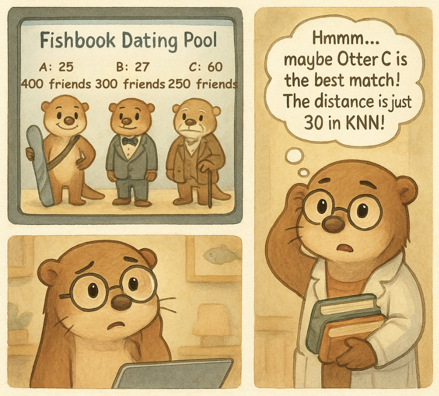
Oda: 30 years old, 250 friends.
| otter | age | friends | age gap | friends gap | distance |
|---|---|---|---|---|---|
| A | 25 | 400 | 5 | 150 | 150.1 |
| B | 27 | 300 | 3 | 50 | 50.1 |
| C | 60 | 250 | 30 | 0 | 30.0 |
Otter C is twice Oda’s age, and still the “nearest”.
Same problem as pounds and feet: a 30 year gap counts as 30, a 50 friend gap counts as 50.
Image generated by OpenAI GPT-2.5-sunburst model
Sea otter or river otter?
A biologist measured 22 otters on the BC coast and already knows each one’s species. A new otter (★): 1150 mm long, hind feet 8.6 cm wide.
{
  // Draw only: the otters and the axis range were prepared in R.
  const v = transpose(otter_views).find(d => d.view === "stretched");
  return Plot.plot({
    width: 460, height: 366, marginLeft: 70, marginBottom: 56, marginTop: 10, marginRight: 10,
    style: {fontSize: "16px", background: "transparent"},
    x: {domain: [v.x_min, v.x_max], label: "Body length (mm)", labelAnchor: "center", grid: true},
    y: {domain: [v.y_min, v.y_max], label: "Hind foot width (cm)", labelAnchor: "center", grid: true},
    color: {domain: ["river otter", "sea otter"], range: ["#2a78d6", "#eb6834"], legend: true},
    marks: [
      Plot.dot(transpose(otter_points).filter(d => d.units === "raw units"),
        {x: "length", y: "foot", fill: "species", r: 5, fillOpacity: 0.8}),
      Plot.dot(transpose(otter_new_pts).filter(d => d.units === "raw units"),
        {x: "length", y: "foot", symbol: "star", r: 10, fill: "#52514e", stroke: "white"})
    ]
  });
}
What does KNN with K = 3 predict for the new otter?
- (A) Sea otter
- (B) River otter
- (C) It’s a tie
📏 What KNN actually measures
{
  // Draw only: units, views, links, labels and every number were computed in R.
  const s = transpose(otter_steps).find(d => d.step === otter_step);
  const v = transpose(otter_views).find(d => d.view === s.view);
  const links = transpose(otter_step_links).filter(d => d.step === otter_step);
  return Plot.plot({
    width: 460, height: 366, marginLeft: 70, marginBottom: 56, marginTop: 10, marginRight: 10,
    style: {fontSize: "16px", background: "transparent"},
    x: {domain: [v.x_min, v.x_max], label: s.x_label, labelAnchor: "center", grid: true},
    y: {domain: [v.y_min, v.y_max], label: s.y_label, labelAnchor: "center", grid: true},
    color: {domain: ["river otter", "sea otter"], range: ["#2a78d6", "#eb6834"], legend: true},
    marks: [
      Plot.dot(transpose(otter_points).filter(d => d.units === s.units),
        {x: "length", y: "foot", fill: "species", r: 5, fillOpacity: links.length ? 0.35 : 0.8}),
      Plot.link(links, {x1: "length_new", y1: "foot_new", x2: "length", y2: "foot",
        stroke: "#52514e", strokeWidth: 2}),
      Plot.dot(links, {x: "length", y: "foot", fill: "species", r: 7, stroke: "white"}),
      Plot.dot(transpose(otter_new_pts).filter(d => d.units === s.units),
        {x: "length", y: "foot", symbol: "star", r: 10, fill: "#52514e", stroke: "white"})
    ]
  });
}
{
// Print only: every line of working was computed in R (otter_step_lines).
const lines = transpose(otter_step_lines).filter(d => d.step === otter_step);
return html`<div style="font-size: 20px; line-height: 1.8; margin-top: 2em;">
${lines.map(d => html`<div style="color: ${d.colour};">${d.text}</div>`)}
</div>`;
}✏️ How to standardize
\text{standardized value} = \frac{\text{value} - \text{mean}}{\text{standard deviation}}
{
  // Draw only: the values at every stage and the captions were computed in R.
  const s = transpose(std_stages).find(d => d.stage === std_stage);
  const pts = transpose(std_strips).filter(d => d.stage === std_stage);
  const chart = Plot.plot({
    width: 900, height: 210, marginLeft: 120, marginBottom: 46, marginRight: 30,
    style: {fontSize: "16px", background: "transparent"},
    x: {label: s.name, labelAnchor: "center", grid: true},
    y: {domain: [-0.5, 1.5], axis: null},
    color: {domain: ["Body length", "Foot width"], range: ["#eb6834", "#2a78d6"]},
    marks: [
      Plot.dot(pts, {x: "value", y: "y", fill: "column", r: 4, fillOpacity: 0.6}),
      Plot.text(transpose(std_labels), {y: "y", text: "column", frameAnchor: "left",
        dx: -115, textAnchor: "start", fill: "column", fontWeight: "bold"})
    ]
  });
  return html`${chart}<div class="ds-caption" style="font-size: 19px;">${s.caption}</div>`;
}KNN in R with tidymodels
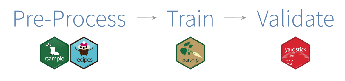
🧰 tidymodels: one toolbox for modelling
- A collection of packages, like
tidyverseis for data. - It computes the distances, standardizes, and predicts for us.
- Same 4 steps for almost every model we meet in this course.
🔬 Step 0: load the packages and the data
🔬 Step 1: a recipe()
A recipe says what to predict, from which columns, and how to prepare the data first.
Class ~ Perimeter + Concavity
read
~ as “is predicted by”: what we predict ~ the predictors
🔬 Step 2: a model specification
Which model, with which settings. No data yet.
- model type:
nearest_neighbor() - arguments:
neighbors = 3(K),weight_func = "rectangular"(every neighbour’s vote counts the same) - engine:
set_engine("kknn"), the package that does the work - mode:
set_mode("classification"), predict a category
🔬 Step 3: a workflow, then fit()
workflow(): put the recipe and the model together.fit(): run it on the training data.- For KNN, fitting means remembering the standardized training tumours, plus the mean and sd of each column.
🔬 Step 4: predict()
Our new tumour from the start of class: Perimeter = 0.2, Concavity = 3.3.
🔬 Try it yourself
- Predict tumour B from the K slider: Perimeter = -0.2, Concavity = 0.6.
- Change
neighborsto 1, then 5, then 7. Do you get the same answers as the slider?
🗺️ Today in one table
| Idea | In words | In R |
|---|---|---|
| classification | predict a category for a new observation | set_mode("classification") |
| distance | straight line between two points | computed for us |
| K-nearest neighbours | keep the K nearest neighbours, predict the category for new data using majority vote | nearest_neighbor(neighbors = K) |
| standardize | subtract the mean, divide by the sd | step_center(), step_scale() |
| workflow | recipe and model together | workflow(), fit(), predict() |
More in the textbook: Chapter 5, Classification I: training and predicting
📅 Upcoming Due Dates
Important
worksheet_classification1due Monday, Oct 19, 11:59PMtutorial_classification1due Monday, Oct 19, 11:59PM
❓ Questions?
If not, let’s work on this week’s worksheet together.
- Want to save these slides? Right click → Print → Save to PDF.
- Your code and notes only save if you save as a PDF!
- Which function do I use? Every function so far, week by week: Function cheatsheet