DSCI 100 Week 4 : Effective data visualization
Sky (Kehan) Sheng
Housekeeping
- Release of lecture recordings of Section 008?
- Fill out the Qualtrics survey here: https://ubc.ca1.qualtrics.com/jfe/form/SV_bIRJA5JgOjp5Gei
![]()

🔁 Week 3 Recap: Cleaning and wrangling
Image generated by OpenAI GPT-2.5-sunburst model
iClicker: Which function makes this tidy?
🔬 Demo: pivot_longer()
cols: which columns to collapse into longer rowsnames_to: the new column that holds the collapsed column name (i.e.,yearnow records either1999or2000)values_to: the new column that holds the values in each cell in the old columns (i.e.,casesnow records the number of cases in each country in each year)
🤔 And this one?
| country | year | key | value |
|---|---|---|---|
| Afghanistan | 1999 | cases | 745 |
| Brazil | 1999 | cases | 37737 |
| Brazil | 1999 | population | 172006362 |
| China | 1999 | cases | 212258 |
| China | 1999 | population | 1272915272 |
iClicker: Pick the right penguins
Week 4: Effective data visualization
Image generated by OpenAI GPT-2.5-sunburst model
🚨 Visualization Crime Zone: What’s wrong with this bar plot?
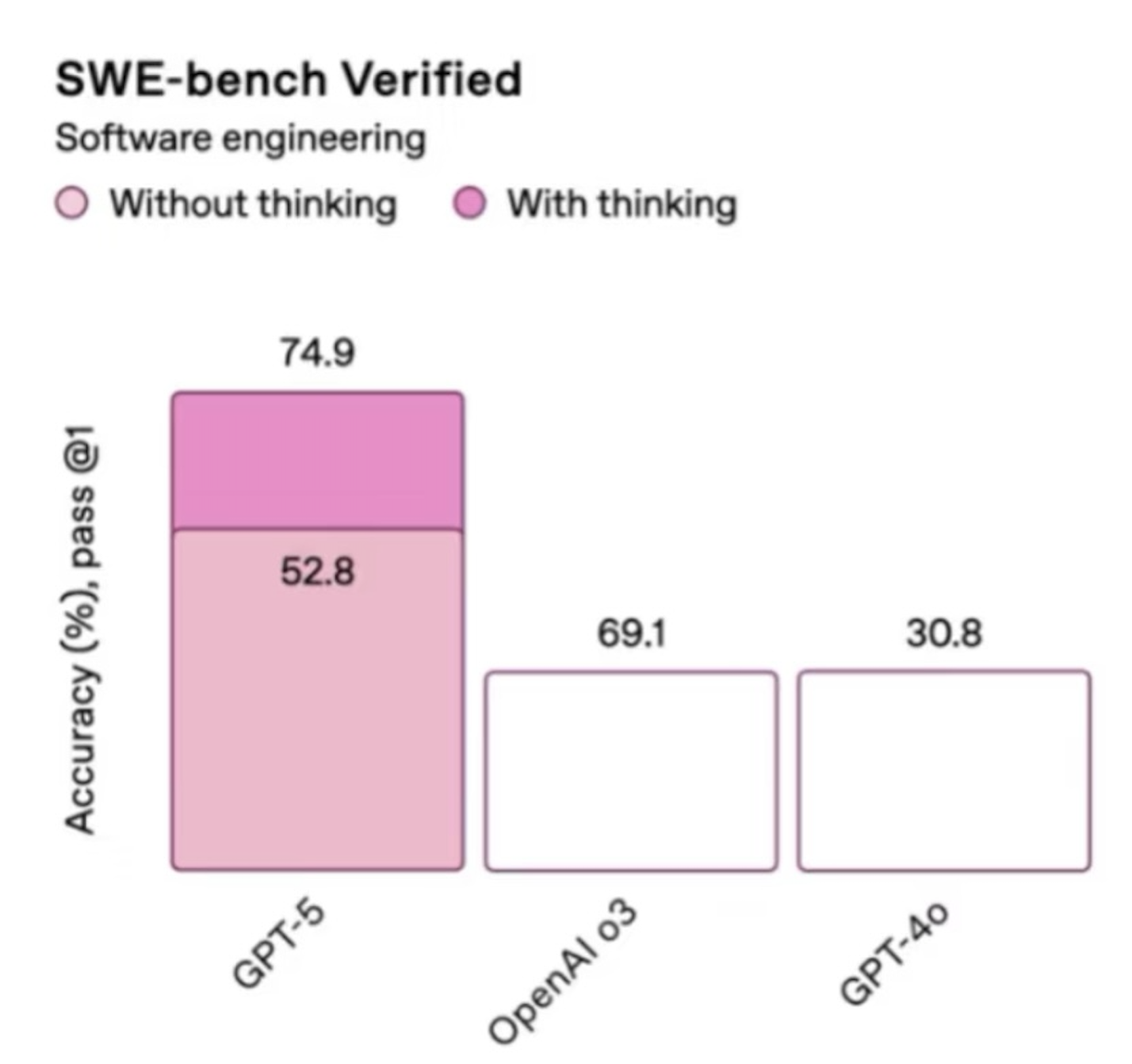
The bar heights don’t match the numbers.
Source: OpenAI GPT-5 launch livestream, August 2025
Is global warming real?
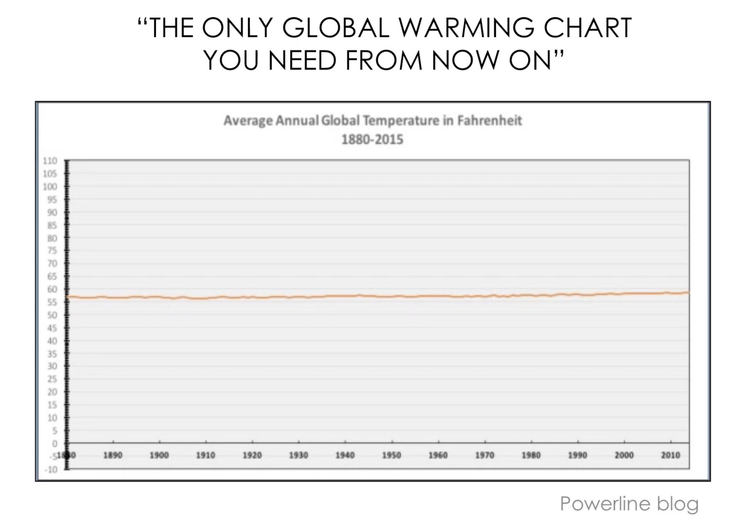
Source: Powerline blog. Background image generated by OpenAI GPT-2.5-sunburst model.
Same data, honest axis
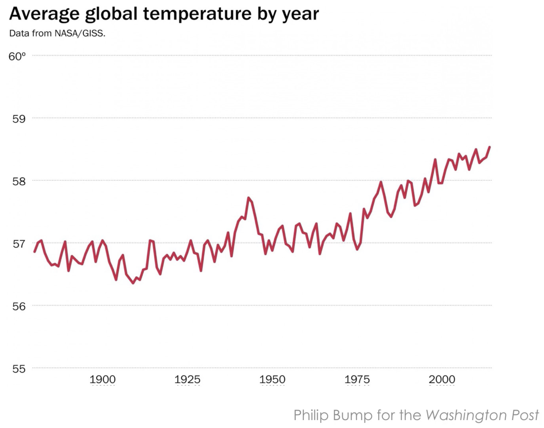
Philip Bump for the Washington Post, data from NASA/GISS.
🤔 Is the air changing?
CO₂ traps heat in the atmosphere, so more of it means a warmer planet. Scientists on Mauna Loa, Hawaii, measured the CO₂ in the air every month from 1959 to 1997.
| CO₂ (ppm) | month |
|---|---|
| 315.42 | 1959-01 |
| 316.31 | 1959-02 |
| 316.50 | 1959-03 |
| 317.56 | 1959-04 |
| 318.13 | 1959-05 |
| 318.00 | 1959-06 |
| 316.39 | 1959-07 |
| 314.65 | 1959-08 |
… and 460 more rows
Look at the numbers.
Is CO₂ going up, going down, or staying the same?
Could you tell from 468 numbers? 😵💫
🤔 Same numbers, as a picture
{
  // Draw only: every point and the axis range were computed in R.
  const pts = transpose(co2_points).filter(d => d.year < co2_until + 1);
  return Plot.plot({
    width: 880, height: 360, marginLeft: 60, marginBottom: 46,
    style: {fontSize: "16px", background: "transparent"},
    x: {label: "year →", domain: [co2_info.first_year, co2_info.last_year + 1],
        tickFormat: d => String(d)},
    y: {label: "↑ CO₂ (ppm)", domain: [co2_info.y_min, co2_info.y_max], grid: true},
    marks: [Plot.line(pts, {x: "year", y: "concentration", stroke: "#2a78d6", strokeWidth: 2})]
  });
}
A good picture answers the question in one second.
🔄 Where are we in the workflow?
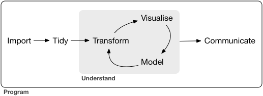
Week 3 was tidy and transform. Today is visualize.
Source: Grolemund & Wickham, R for Data Science
✏️ Designing a visualization
- Ask a question, then answer it.
- The purpose of a visualization is to answer a question about a data set.
- A good visualization answers the question clearly. A great visualization also hints at the question itself.
✏️ What questions can a plot answer?
Visualizations alone help us answer two types of questions:
- descriptive: What are the 12 largest landmasses on Earth?
- exploratory: Is there a relationship between penguin body mass and bill length?
inferential,predictive,causal,mechanistic: we need more tools than a plot for these
🧱 Plots in R with ggplot2
ggplot2 comes with tidyverse. A plot has three key pieces:
- aesthetic mappings
aes(): which column goes to which visual property (x, y, colour, …) - geometric objects
geom_*(): how to draw it (points, lines, bars, …) - scales: transform variables, set limits
Add the pieces one at a time with +.
Tip
Visualization is an iterative procedure. Try things, make mistakes, and refine!
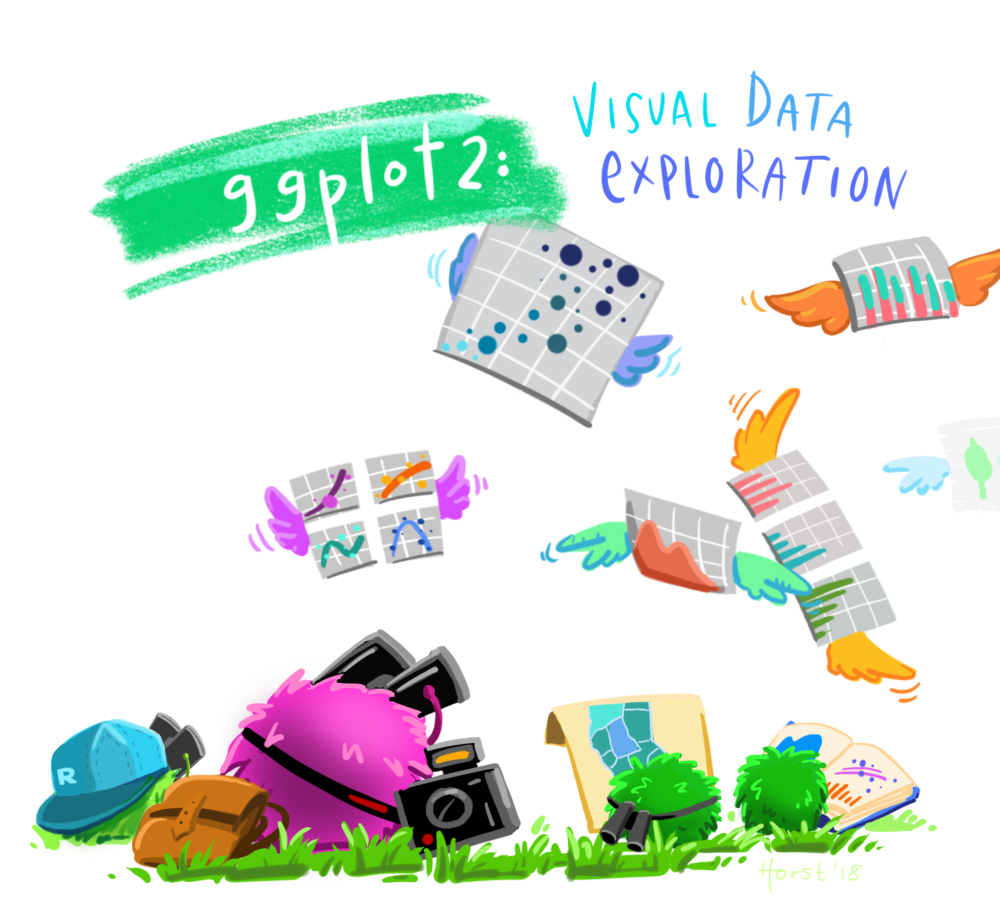
Artwork by Allison Horst. Most chart images today are from Claus O. Wilke, Fundamentals of Data Visualization.
🧱 Types of variables
A variable is a characteristic we measured. It comes in two kinds:
- Categorical: falls into groups (categories). e.g. marital status, continent
- Quantitative: a number on a scale, usually with units. e.g. height, horsepower
The kind of variable, and the question you ask, decide which plot to use.
⚠️ A number is not always quantitative: a car has 4, 6 or 8 cylinders. Those are three groups.
📊 Scatter plots
One of the best ways for us to battle climate change is to drive cars less frequently or drive cars with better fuel efficiency! Better fuel economy means less CO₂ generated per mile.
Is there a relationship between horsepower and fuel economy of an engine (relationship between two quantitative variables)? Does the number of cylinders change that?
🧱 What each piece added
{
  // Draw only: the cars, labels and axis range were prepared in R.
  const s = build_row;
  const r = transpose(builder_range)[0];
  const color = s.color_mode === "gradient"
    ? {type: "linear", range: ["#c7dbf4", "#123f75"], legend: true, label: s.color_label}
    : s.color_mode === "group"
      ? {type: "categorical", domain: ["4", "6", "8"],
         range: ["#2a78d6", "#eb6834", "#52514e"], legend: true, label: s.color_label}
      : undefined;
  const fill = s.color_mode === "gradient" ? "cyl"
    : s.color_mode === "group" ? "cyl_group" : "#52514e";
  return Plot.plot({
    width: 500, height: 360, marginLeft: 56, marginBottom: 46,
    style: {fontSize: "16px", background: "transparent"},
    x: {domain: [r.x_min, r.x_max], label: s.x_label, labelAnchor: "center",
        axis: s.show_axes ? "bottom" : null, grid: s.show_axes},
    y: {domain: [r.y_min, r.y_max], label: s.y_label, labelAnchor: "center",
        axis: s.show_axes ? "left" : null, grid: s.show_axes},
    color,
    marks: [
      Plot.frame({stroke: "#b8b6b0"}),
      s.show_points
        ? Plot.dot(transpose(builder_cars), {x: "hp", y: "mpg", fill, r: 5})
        : null
    ]
  });
}
📊 Line plots
Show a trend over an ordered quantity, usually time.
How has CO₂ in the air changed over the last 40 years?
📊 Why a line and not points?
{
  // Draw only: points, the zoom flag and both axis ranges were computed in R.
  const all = transpose(co2_points);
  const pts = co2_zoomed ? all.filter(d => d.in_zoom) : all;
  const x = co2_zoomed ? [co2_info.zoom_from, co2_info.zoom_to]
                       : [co2_info.first_year, co2_info.last_year + 1];
  const y = co2_zoomed ? [co2_info.zoom_y_min, co2_info.zoom_y_max]
                       : [co2_info.y_min, co2_info.y_max];
  const mark = co2_geom === "geom_line()"
    ? Plot.line(pts, {x: "year", y: "concentration", stroke: "#2a78d6", strokeWidth: 2})
    : Plot.dot(pts, {x: "year", y: "concentration", fill: "#2a78d6", r: co2_zoomed ? 4 : 2.5});
  return Plot.plot({
    width: 880, height: 360, marginLeft: 60, marginBottom: 46,
    style: {fontSize: "16px", background: "transparent"},
    x: {label: "year →", domain: x, tickFormat: d => String(d)},
    y: {label: "↑ CO₂ (ppm)", domain: y, grid: true},
    marks: [mark]
  });
}
The line connects the measurements in order, so the up and down of every year shows.
📊 Bar plots
Compare amounts across categories.
Which are the 12 largest landmasses on Earth? Are they all continents, or are some islands just as large?
stat controls how geom_bar() turns rows into bar height. By default it counts rows. stat = "identity" means: skip counting, use the y value as is.
📊 Why did geom_bar() complain?
{
  // Draw only: counts, sizes, code and caption were computed in R.
  const m = transpose(bar_modes).find(d => d.mode === bar_mode);
  const color = {domain: ["Continent", "Other"], range: ["#2a78d6", "#eb6834"], legend: true};
  const chart = bar_mode === "count the rows"
    ? Plot.plot({
        width: 880, height: 330, marginLeft: 60, marginBottom: 46,
        style: {fontSize: "16px", background: "transparent"}, color,
        x: {label: "is_continent"}, y: {label: "↑ count (rows)", grid: true},
        marks: [Plot.barY(transpose(bar_counts), {x: "is_continent", y: "n", fill: "is_continent"}),
                Plot.text(transpose(bar_counts), {x: "is_continent", y: "n", text: "n", dy: -12}),
                Plot.ruleY([0])]
      })
    : Plot.plot({
        width: 880, height: 330, marginLeft: 120, marginBottom: 46,
        style: {fontSize: "16px", background: "transparent"}, color,
        x: {label: "size (1000 square miles) →", grid: true},
        y: {label: null, domain: transpose(bar_sizes).map(d => d.landmass)},
        marks: [Plot.barX(transpose(bar_sizes), {x: "size", y: "landmass", fill: "is_continent"}),
                Plot.ruleX([0])]
      });
  return html`<pre style="font-size: 15px;"><code>${m.code}</code></pre>${chart}
    <div class="ds-caption">${m.what}</div>`;
}
📊 Histograms
Show the distribution of one quantitative variable: how the values are spread out.
{
  // Draw only: dots, bins and the axis range were computed in R.
  const r = transpose(hist_range)[0];
  const bins = transpose(hist_bins).filter(d => d.binwidth === bin_width);
  const x = {domain: [r.x_min, r.x_max]};
  const strip = Plot.plot({
    width: 880, height: 80, marginLeft: 60,
    style: {fontSize: "16px", background: "transparent"},
    x: {...x, axis: null}, y: {axis: null, domain: [-0.5, 0.5]},
    marks: [Plot.ruleX(bins, {x: "bin_start", stroke: "#b8b6b0"}),
            Plot.dot(transpose(hist_dots), {x: "life_expectancy", y: "jitter",
                                            fill: "#52514e", r: 3, fillOpacity: 0.6})]
  });
  const hist = Plot.plot({
    width: 880, height: 270, marginLeft: 60, marginBottom: 46,
    style: {fontSize: "16px", background: "transparent"},
    x: {...x, label: "life expectancy in 2016 (years) →"},
    y: {label: "↑ countries", grid: true},
    marks: [Plot.rectY(bins, {x1: "bin_start", x2: "bin_end", y: "n",
                              fill: "#2a78d6", inset: 1}),
            Plot.ruleY([0])]
  });
  return html`${strip}${hist}`;
}
{
// Print only: every number was computed in R (hist_summary, hist_range).
const s = transpose(hist_summary).find(d => d.binwidth === bin_width);
const r = transpose(hist_range)[0];
return html`<div class="ojs-readout">
<span class="grey">${r.n_countries} countries</span> cut into
<b class="blue">${s.n_bins}</b> bins. The tallest bin, ${s.max_from} to ${s.max_to} years,
holds <b class="orange">${s.max_n}</b> countries.</div>`;
}🔬 Demo: Life expectancy by continent
Was there a difference in life expectancy across continents in 2016?
🗺️ Which plot for which question?
| Question | Variables | Plot | geom |
|---|---|---|---|
| How are two numbers related? | 2 quantitative | scatter | geom_point() |
| How does it change over time? | quantitative over time | line | geom_line() |
| How do amounts compare across groups? | categorical + amount | bar | geom_bar(stat = "identity") |
| How are the values spread out? | 1 quantitative | histogram | geom_histogram() |
More in the textbook: Chapter 4, Effective data visualization
📏 Rule of thumb 1: No tables or pie charts
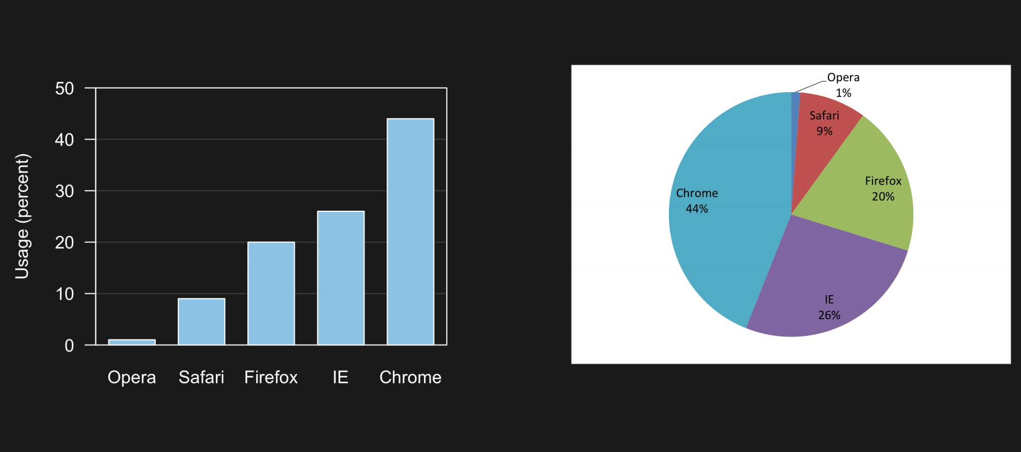
Which one is easier to read?
Source: Claus O. Wilke, Fundamentals of Data Visualization
📏 Rule of thumb 2: No 3D
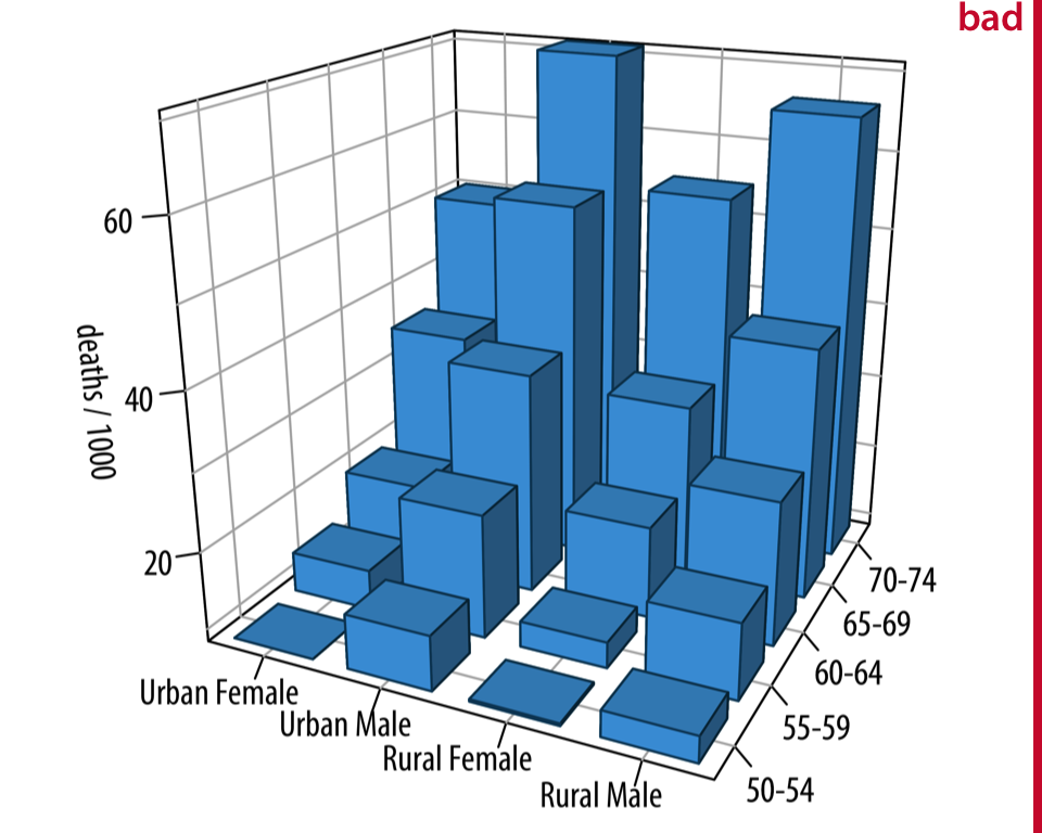
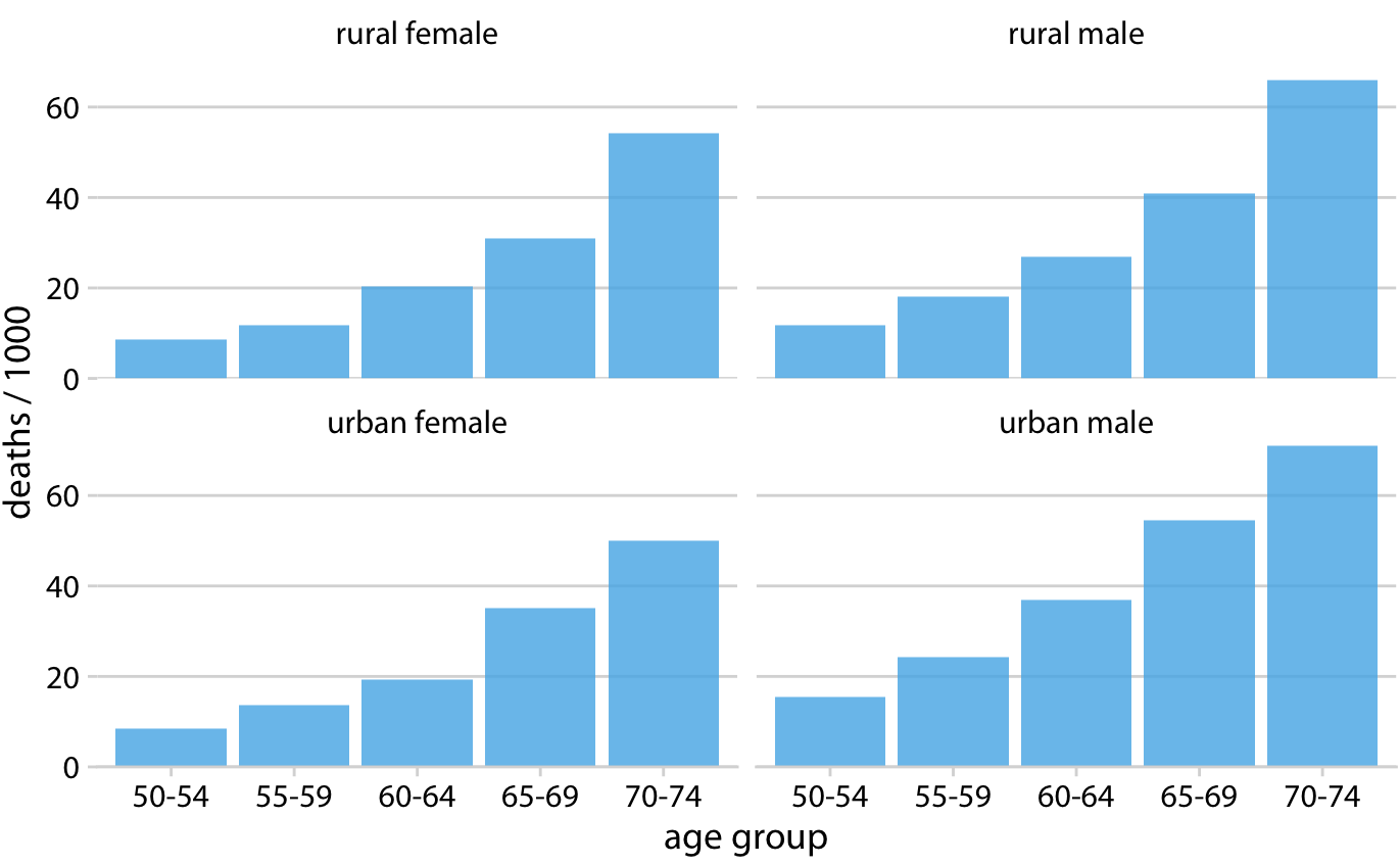
Source: Claus O. Wilke, Fundamentals of Data Visualization
📏 (Bonus) Sky’s exception: when 3D earns its place
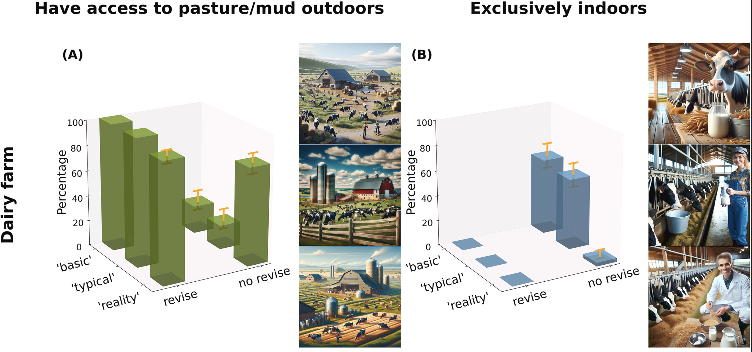
Sheng et al., 2026. Silencing controversial realities through prompt revision: The erasure of intensive livestock farming in text-to-image generative AI. Technology in Society, 103466.
📏 Rule of thumb 3: Simple, colourblind-friendly colours
Tip
Check your own plots: Coblis, Color Blindness Simulator
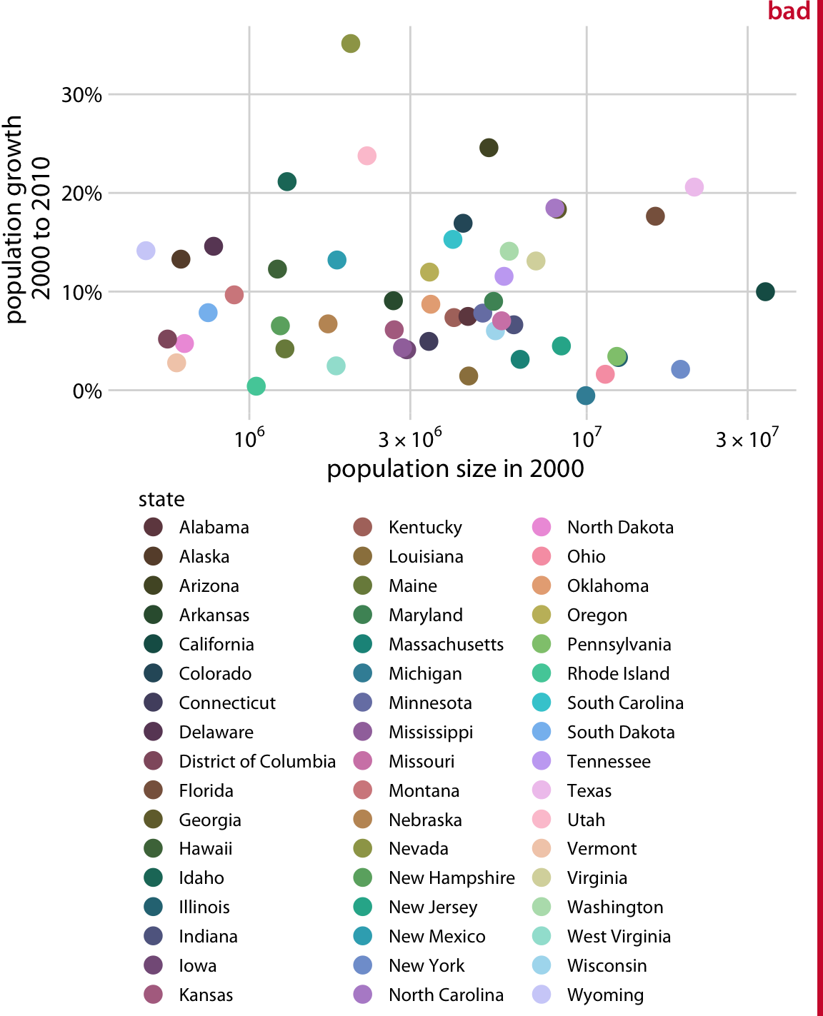
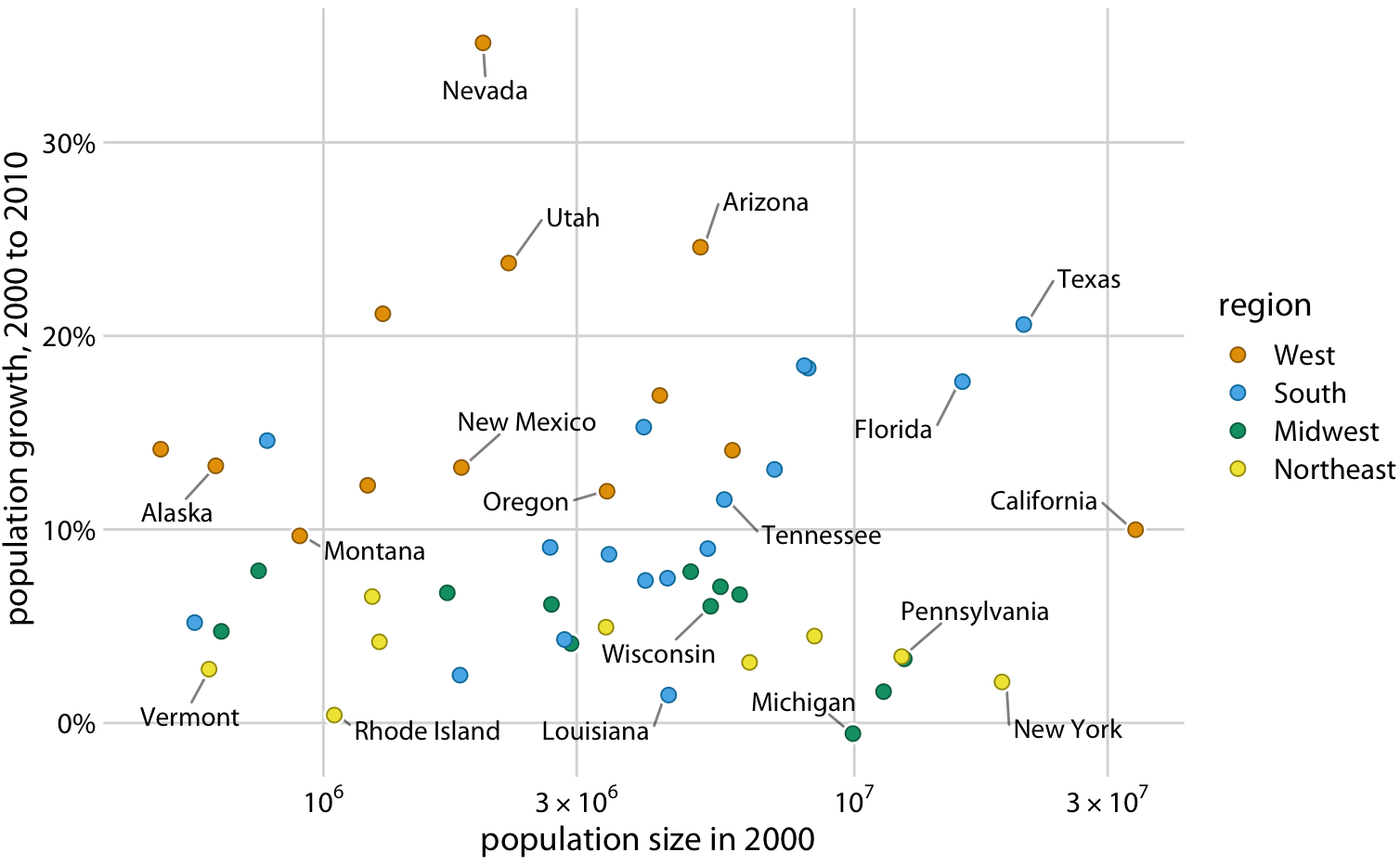
Source: Claus O. Wilke, Fundamentals of Data Visualization
Colourblind-friendly palettes in R
R has lots of colourblind-friendly palettes, such as the viridis package:
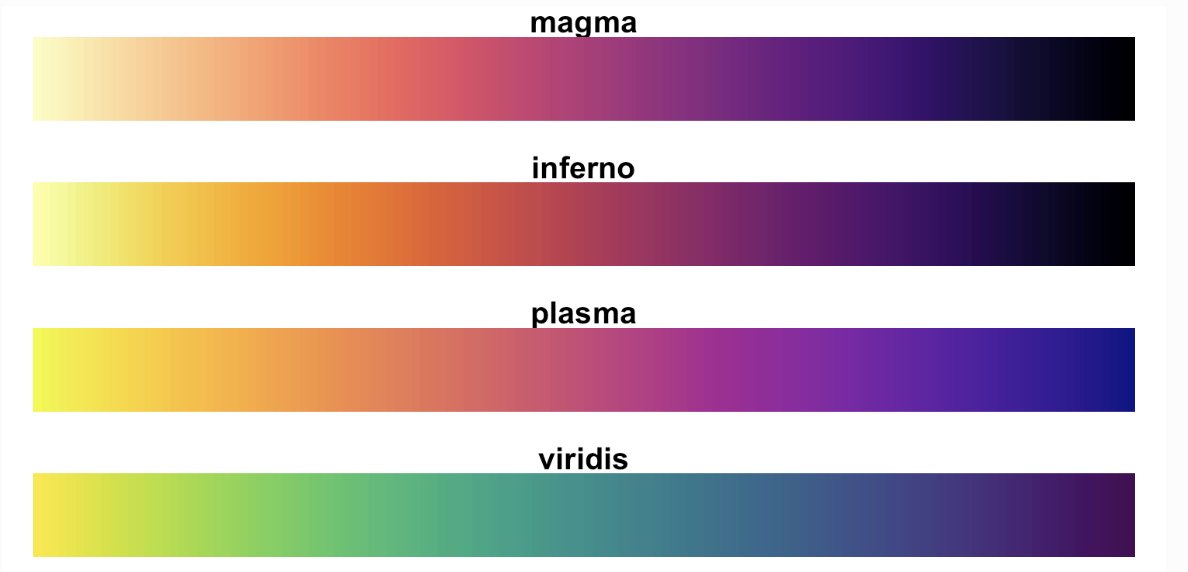
Colour palettes from the viridis R package. Source: viridisLite documentation
📏 Rule of thumb 4: Legible labels and legends
A great visualization tells its own story without you standing next to it.
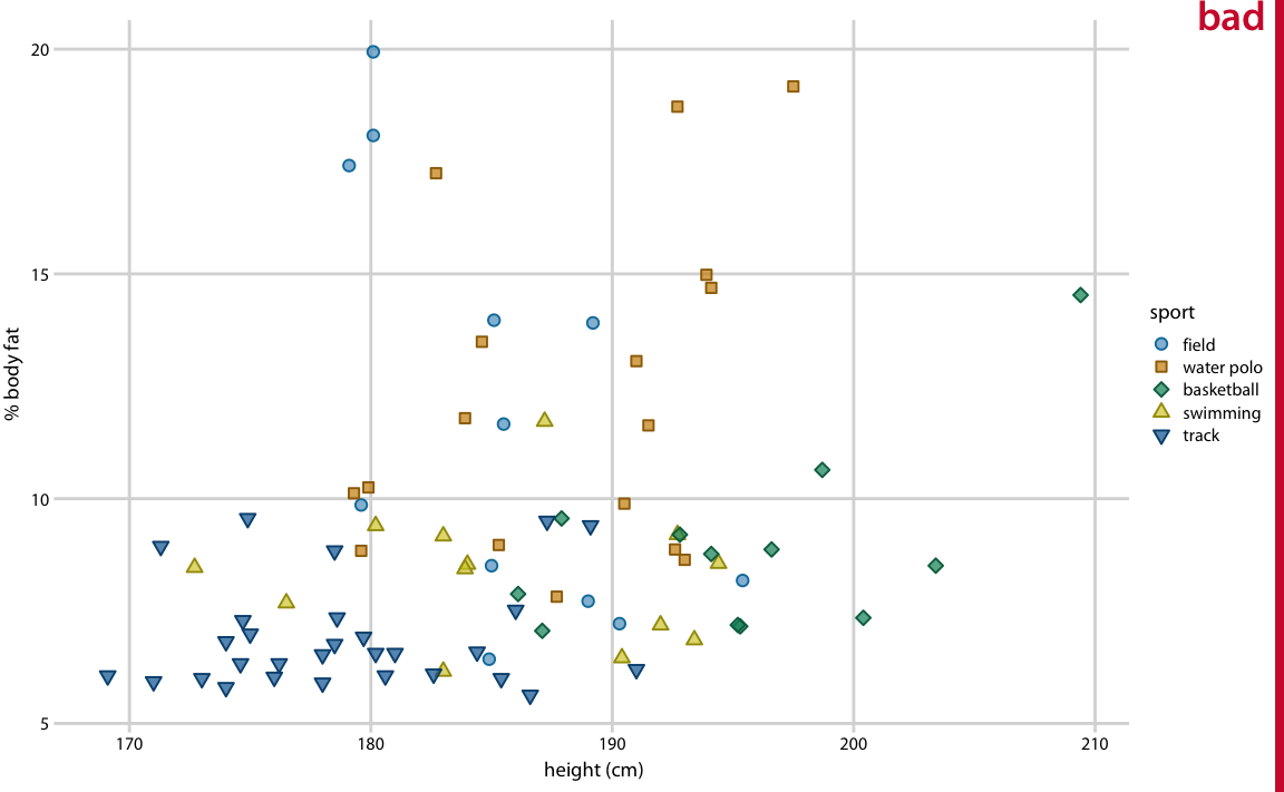
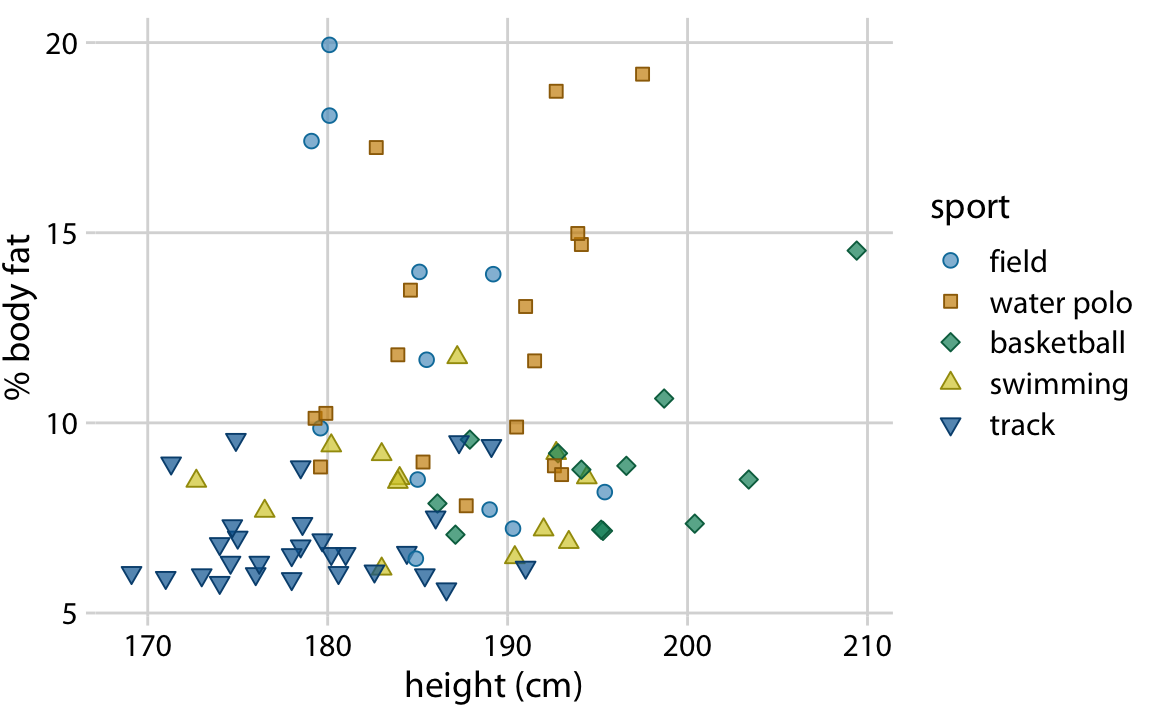
Source: Claus O. Wilke, Fundamentals of Data Visualization
📏 Rule of thumb 5: Avoid overplotting
Usually the fix is a different geometric object. 53,940 diamonds on one plot:
- Add
alpha = 0.2togeom_point() alphasets transparency, between 0 (invisible) and 1 (solid)
📅 Upcoming Due Dates
Important
worksheet_vizdue next Monday, Oct 5, 11:59pmtutorial_vizdue next Monday, Oct 5, 11:59pm
Tip
Before next class: please register for a free GitHub account, it will help you follow along: https://github.com/signup
Need a data viz refresh? Check out this optional video.
❓ Questions?
If not, let’s work on this week’s worksheet together.
- Want to save these slides? Right click → Print → Save to PDF.
- Your code and notes only save if you save as a PDF!